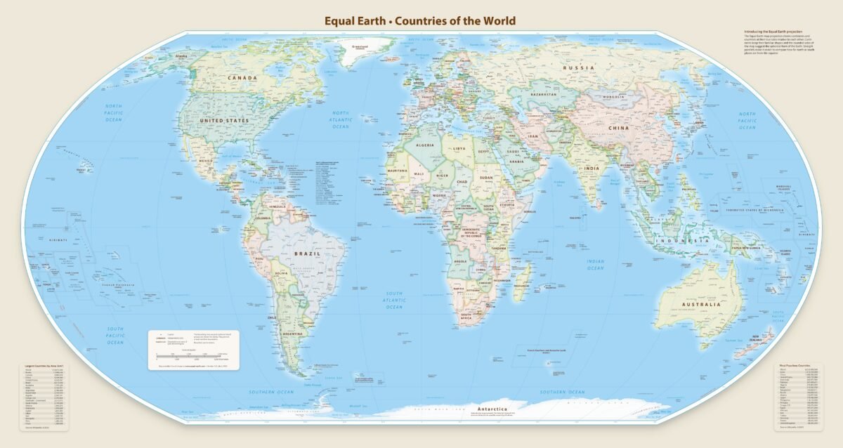
For centuries, the way we view the world has been skewed by the Mercator projection, which drastically inflates the size of northern continents while shrinking the tropics. Equal-Earth.com is at the forefront of correcting this distortion, offering a modern, aesthetically pleasing alternative that prioritizes geographic honesty and fairness.
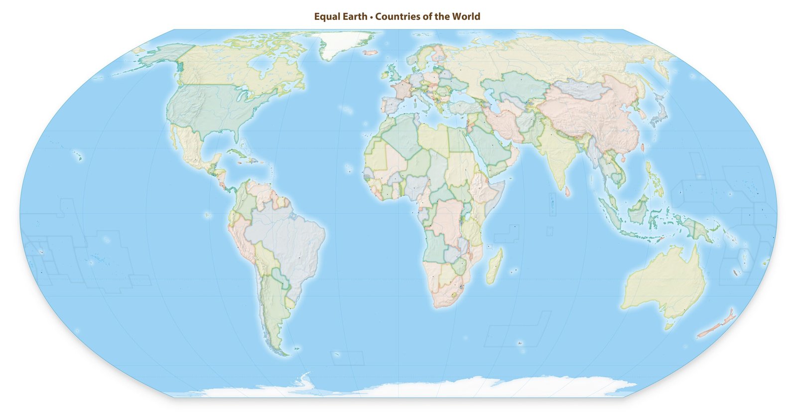
The Equal Earth projection—developed by cartographers Bojan Šavrič, Tom Patterson, and Bernhard Jenny—is an “equal-area” map. This means every continent and country is shown at its true relative size.
Equal Earth
Under this lens, Africa finally appears fourteen times larger than Greenland, reflecting the physical reality of our planet. Unlike previous attempts at fairness that resulted in “stretched” landmasses, the Equal Earth projection maintains a visually balanced, rounded shape similar to the popular Robinson projection.
The website serves as a public domain hub where educators, organizations, and travelers can download high-resolution wall maps for free. By providing a “world map for everyone,” Equal-Earth.com ensures that our visual understanding of the globe is no longer a matter of bias, but of precision.
For anyone looking to understand the world’s true proportions, it is an indispensable resource for a more accurate global perspective.